Introduction
This is the 4th part of the topic of how to visualize Python charts in Power BI (part one, two, and three). Previously, we talked about violin plots, box plots, and hexagonal binning plots. In this chapter, we will cover the following topics:
First, we will talk about Error bars. Secondly, we will use Heatmaps. Finally, we will show how to use Boxen plots. Prerequisites
I am assuming that you are already connected to the vTargetMail view in the SQL Server view explained in part 1.
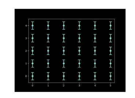
Error bars to visualize Python charts
The error bars represent the


