Introduction
This is the 3rd part of the topic of how to visualize Python charts in Power BI. In the previous article, we learned how to work with histograms, 3D charts, and trigonometric plots. In this chapter we will learn the following topics:
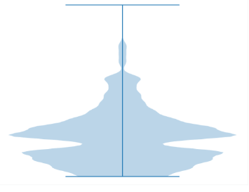
First, we will learn how to create the violin plot. Secondly, we will learn how to create a Box plot. Finally, we will learn to create an Hexbin plot. Requirements
First, I am assuming that you already read part 1 and is already connected to the SQL Server AdventureworksDW sample database and the vTargetMail view.


